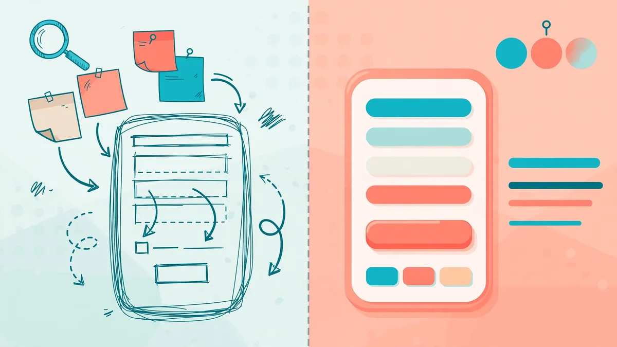
Job adverts often bundle UX and UI into one title. Consequently, beginners assume both labels describe the same craft. Hiring managers sometimes make that identical mistake during interviews. Nevertheless, the ux vs ui design difference becomes obvious in daily work. One discipline shapes how a product behaves and feels to use. Meanwhile, the other discipline shapes how that product looks and responds visually.
This guide separates both fields without recycled analogies or vague definitions. Instead, one ordinary checkout form gets traced through both lenses. Additionally, a week in each job shows who actually does what. Finally, a practical decision section helps learners and employers choose wisely.
What is UX design?
UX design means user experience design in full. Essentially, it covers every moment someone spends with a product. A signup flow counts, and so does an error message. Even a confusing settings page forms part of that experience. Therefore, UX designers study behaviour before they draw anything polished.
Research usually opens the user research wireframes prototypes ux process. Firstly, designers interview users and observe real tasks carefully. Secondly, findings turn into personas, journey maps, and problem statements. Wireframes then sketch screen layouts in rough, low-detail form. Prototypes later connect those screens into clickable, testable flows.
Testing closes the loop before development begins in earnest. Participants attempt realistic tasks while designers watch silently. Struggles reveal unclear labels, missing steps, or wrong assumptions. Designers then revise the flow and test again. Ultimately, good UX feels almost invisible because nothing blocks progress.
Importantly, UX work extends far beyond screens and software. Service touchpoints, support scripts, and email timing all count. For example, a password reset email shapes trust significantly. Similarly, an honest delivery estimate calms customers during delays. Hence, UX thinking follows the whole journey, not single pages.
What is UI design?
UI design means user interface design in full. Specifically, it covers the visual surface people see and touch. Buttons, menus, cards, and form fields all belong here. Typography, colour, spacing, and icons also sit within UI. Consequently, UI designers turn approved flows into attractive, usable screens.
Visual hierarchy guides most UI decisions every day. Larger headings signal importance before smaller supporting text does. Strong contrast highlights the primary action on each screen. Consistent spacing, meanwhile, helps people scan content quickly. Readers curious about type choices can explore this typography and font guide for practical examples.
UI designers also build design systems and ui components libraries. Such libraries store reusable buttons, inputs, and navigation patterns. Developers then assemble screens from approved, tested parts. As a result, products stay consistent across dozens of pages. Furthermore, updates become faster because one component change spreads everywhere.
Interaction states demand equal care from UI specialists. Hover effects, focus rings, and loading indicators communicate system feedback. Disabled buttons, for instance, must look unavailable yet remain readable. Error states, similarly, need colour plus text, never colour alone. Therefore, polished UI quietly explains what the system is doing.
How does the ux vs ui design difference look side by side?
Definitions help, yet a direct comparison clarifies things faster. Accordingly, the table below contrasts focus, tasks, and deliverables. Both columns matter equally, although their timing differs considerably. UX decisions generally arrive earlier in a project. UI refinement, in contrast, intensifies after flows gain approval.
| Aspect | UX design | UI design |
|---|---|---|
| Core question | Does this flow solve the right problem? | Does this screen look clear and inviting? |
| Main focus | Research, structure, behaviour, usability | Layout, colour, typography, visual states |
| Typical tasks | Interviews, journey maps, wireframes, testing | Mockups, components, icons, style guides |
| Key deliverables | Personas, flows, prototypes, test reports | Screen designs, design systems, asset files |
| Success signal | People finish tasks easily and confidently | People understand screens quickly and trust them |
| Typical tools | Survey tools, whiteboards, prototyping software | Design software, icon libraries, colour tools |
Notice how neither column mentions the other discipline’s craft. Admittedly, real teams blur these boundaries on small projects. Still, the underlying questions stay different in every case. One side asks whether a journey works at all. Conversely, the other side asks whether that journey looks right.
What does a checkout form reveal about UX and UI?
Abstract definitions fade quickly, whereas concrete examples stick. Hence, this section follows one checkout form through both disciplines. The scenario involves a small online store selling shoes. Customers abandon checkout because the form feels long and risky. Anyone studying how retention and customer experience shape e-commerce results will recognise this pattern instantly.
How does the UX pass reshape the checkout form?
Research begins before anyone touches the form layout. Designers interview recent buyers and watch recorded checkout sessions. Recordings show shoppers hunting for delivery costs very early. Others abandon checkout when account creation appears mandatory. Consequently, the problem involves trust and sequencing, not decoration.
Structural fixes follow directly from those observations. Firstly, guest checkout becomes the default option immediately. Secondly, delivery costs appear beside the basket summary upfront. A progress indicator, additionally, shows three clear steps ahead. Designers also group address fields into logical, familiar chunks.
Wireframes then test the revised structure with real shoppers. Participants complete orders faster and ask fewer questions. One participant, however, still hesitates at the payment step. Designers therefore add accepted card icons and reassurance text nearby. Prototypes confirm the hesitation drops before development starts properly.
How does the UI pass polish the same checkout form?
Visual design starts only after the flow proves itself. Buttons adopt one consistent style across every checkout step. The primary action uses strong contrast and generous padding. Secondary links, meanwhile, stay visible but deliberately quieter. As a result, eyes land on the correct action first.
Field design receives painstaking attention during this pass. Labels sit above inputs instead of disappearing inside them. Error messages appear in red text plus a clear explanation. Sufficient spacing, furthermore, prevents cramped tapping on small phones. Autofill-friendly field order also matches browser expectations closely.
Trust signals complete the visual treatment near payment. Payment icons render crisply at a modest, proportionate size. Padlock imagery supports the security message without shouting. Overall, the form now looks calm, credible, and consistent. Shoppers who later receive parcels connect that calm to the wider delivery and distribution experience behind the store.
How ux and ui work together on a real product?
Neither discipline succeeds alone for very long. Beautiful screens cannot rescue a broken, illogical flow. Equally, a logical flow fails when screens look chaotic. Designers therefore hand work back and forth repeatedly. Feedback from visual testing often reshapes earlier wireframes substantially.
Collaboration usually follows a loose, overlapping rhythm. UX research identifies a problem worth solving first. UI exploration then proposes several visual directions early. Both designers review options together with developers present. Consequently, technical limits surface before anyone falls in love.
Information architecture deserves special attention within this partnership. Debates about information architecture vs ux often confuse beginners. Information architecture organises content, labels, and navigation structure. UX, however, covers that structure plus research and testing. Put simply, architecture forms one important part of UX.
Handoffs work best when both sides share artefacts. Annotated prototypes, for example, explain behaviour beside visual specs. Regular critiques also keep decisions transparent across the team. Readers following how to read technology news and product updates critically will notice similar cross-team patterns elsewhere.
What does a week in each job actually involve?
Job titles sound similar, yet calendars reveal the truth. Comparing ux designer vs ui designer roles week by week helps. Both roles attend meetings, critiques, and planning sessions together. Beyond shared rituals, however, their focused hours diverge sharply.
What fills a UX designer’s week?
Monday might begin with analysing last week’s test recordings. Tuesday often brings stakeholder interviews about upcoming features. Midweek, journey mapping workshops gather product and support colleagues. Wireframing and prototype building then fill focused afternoon blocks. By Friday, a moderated test session validates the newest flow.
Documentation quietly consumes surprising hours for UX specialists. Research summaries must persuade busy managers to act. Test findings, similarly, need prioritising by severity and effort. Hence, writing and presenting count as core UX skills. Curious readers can see how research-led teams operate inside this guide to scaling IT teams and digital work.
What fills a UI designer’s week?
Monday might start with refining screens from approved wireframes. Tuesday often involves building new components for the library. Midweek critiques then examine consistency across recent designs. Icon tweaks, illustration requests, and accessibility checks fill gaps. By Friday, polished files go to developers with specifications.
Developer collaboration dominates many UI afternoons as well. Pixel questions arise once real code meets real screens. Designers adjust spacing, states, and assets during build reviews. Moreover, they audit finished pages against the original mockups. That audit habit protects consistency across large, fast-moving products.
Which skills does each discipline demand?
Skill lists turn vague interest into a learning plan. Admittedly, both disciplines share curiosity and communication basics. Specialisation, though, pulls each skill set in different directions. The two lists below separate shared ground from distinctive strengths.
What are the skills needed for ux design?
Research literacy tops the skills needed for ux design. Designers must plan interviews and moderate tests without bias. Analytical thinking then converts messy observations into clear priorities. Information architecture, wireframing, and prototyping form the practical core. Additionally, basic statistics help when reading survey results honestly.
Soft skills matter just as much in practice. Empathy helps designers hear frustration beneath polite feedback. Storytelling, meanwhile, turns findings into decisions managers support. Workshops also require facilitation skills and patient listening. Without those abilities, excellent research often dies unread.
What are the skills needed for ui design?
Visual craft anchors the skills needed for ui design. Designers need fluent control of layout, colour, and typography. Component thinking also matters because screens rarely stand alone. Design systems reward people who spot patterns and inconsistencies. Furthermore, motion basics help explain transitions and loading states.
Technical awareness strengthens every UI portfolio significantly. Designers should understand responsive behaviour across screen sizes. Accessibility knowledge, especially contrast and focus order, proves essential. Handoff skills, including clear naming and specifications, save developers hours. Teams measuring design impact often borrow thinking from this analysis of ROI for IT firms.
Can one person do ux and ui?
Yes, and small teams rely on such generalists daily. Startups frequently hire one product designer covering both disciplines. That arrangement speeds decisions because handoffs disappear entirely. However, depth inevitably suffers when projects grow complex. Research gets squeezed first whenever deadlines tighten unexpectedly.
Freelancers also commonly offer both services to clients. Their advantage lies in continuity from research to visuals. Their risk, conversely, involves shallow testing and unchecked assumptions. Honest generalists therefore state which discipline they favour openly. Clients can then add specialist help where projects demand it.
Large organisations usually separate the roles quite deliberately. Dedicated researchers protect evidence quality across many product teams. Dedicated UI specialists, meanwhile, guard system consistency at scale. Neither model is universally superior in every context. Instead, team size and product risk should guide the choice.
How do careers and pay develop in both fields?
Any honest ux ui salary and career path discussion needs care. Pay varies considerably by country, city, and employment type. Seniority changes figures substantially, and specialisation changes them further. Industry also matters because finance and healthcare budgets differ. Therefore, no single number describes either profession fairly.
Reliable ranges exist, although readers should check current sources. Official job boards list live salaries beside real vacancies. Established salary surveys, similarly, publish updated ranges by region. Professional communities additionally share anonymised compensation data each year. Checking several sources beats trusting one viral social post.
Career ladders, fortunately, follow recognisable patterns in both fields. Juniors execute defined tasks under regular senior review. Mid-level designers own features and present their reasoning. Seniors then shape strategy, mentor colleagues, and lead critiques. Some designers later move into management or product leadership.
Specialisation opens additional routes as experience grows. UX researchers, accessibility specialists, and design system leads all emerge. Content design also attracts UX designers with writing strengths. UI specialists, meanwhile, may deepen into motion or brand. Portfolios demonstrating outcomes, not just screens, drive most promotions.
Which to learn first ux or ui?
Beginners asking which to learn first ux or ui deserve honesty. Start where your existing strengths already give momentum. Visually driven learners often enjoy early wins through UI. Analytical learners, conversely, may thrive starting with research. Either entry point eventually demands respect for the other discipline.
Market demand should also inform the decision sensibly. Browse local job adverts and count recurring requirements carefully. Some regions advertise hybrid product designer roles almost exclusively. Other markets, in contrast, list separate specialist positions regularly. Your target market matters more than generic online advice.
A sensible sequence helps learners who remain undecided. Firstly, study core UX thinking and basic research methods. Secondly, practise wireframing one complete flow end to end. Afterwards, learn visual fundamentals and build matching polished screens. That order teaches why screens exist before decoration begins.
Which common ux ui misconceptions cause the most confusion?
Myths persist because both terms travel together constantly. Clearing common ux ui misconceptions saves learners wasted effort. Employers benefit too because clearer roles produce better adverts. The five myths below appear in briefs surprisingly often.
- UX means making screens pretty. Actually, appearance belongs mainly to UI work. UX concerns behaviour, structure, and task success primarily.
- UI means choosing colours only. In reality, UI includes layout, states, and component logic. Colour forms just one visible layer of that system.
- Research slows projects down. Conversely, early testing prevents expensive rebuilding after launch. Small studies regularly save large development budgets.
- One hire covers everything forever. Generalists suit early products, although scale creates specialist needs. Growing teams eventually require deeper, separate expertise.
- Users always behave logically. Testing repeatedly shows habits, distractions, and emotions steering behaviour. Evidence therefore beats assumptions in every design review.
Each myth shares one root cause underneath. People judge products by visible surfaces almost instinctively. Invisible research and structure, however, determine whether surfaces succeed. Remembering that distinction protects budgets, timelines, and user goodwill.
What should hiring managers and learners decide next?
Hiring managers should diagnose their actual problem first. Low task completion suggests a UX gap initially. Inconsistent, dated screens suggest a UI gap instead. Many teams, admittedly, face both problems at once. Sequencing research before visual overhaul usually produces better returns.
Learners, meanwhile, should build evidence of thinking quickly. One documented case study beats ten unexplained screen copies. Show research, decisions, failures, and measured improvements clearly. Employers reading such portfolios understand your process within minutes. That clarity matters whether you specialise or stay hybrid.
Ultimately, the ux vs ui design difference is complementary, not competitive. UX gives products a sound, tested skeleton and journey. UI gives that journey a clear, trustworthy, attractive face. Products need both qualities before users return willingly. Choose your next step accordingly, and keep testing assumptions.
Understanding the nuanced differences between UX and UI design is essential not only for professionals in the field but also for businesses aiming to create impactful digital experiences. While UI focuses on the aesthetic and interactive elements of a product, UX encompasses the entire user journey, ensuring that every touchpoint is intuitive and fulfilling. This distinction becomes particularly relevant when considering how these principles apply to various facets of web development, including responsive design. For instance, as users increasingly access websites across diverse devices, the need to implement fluid grids and adaptive layouts becomes paramount. To delve deeper into the intricacies of responsive methodologies, including the essential components such as media queries and breakpoints, it’s crucial to explore what is responsive web design and how it integrates with both UX and UI principles to enhance overall user satisfaction.
Explore more practical guides on WordGlowUp.