Some fonts sell a product. This one, however, tells a story before anyone reads a word. The beauty and beast font turns a name, a title, or a party banner into a little piece of theatre. Moreover, it does that job in seconds, even in a single word.
You have probably seen it on a birthday invitation first. Alternatively, you may have spotted it on a bedroom sign, a cake topper, or a classroom poster. In fact, the lettering looks like it stepped straight out of an old storybook. Consequently, people search for it by many different names every month.
This guide explains the font properly, from style to safe use. Firstly, it clarifies what the font actually is and is not. Secondly, it shows you exactly how to install a font on each device. Thirdly, it covers Canva, Cricut, pairing, alternatives, and licensing in plain language.
What Is the Beauty and Beast Font?
Strictly speaking, there is no single official font sold under this name. Instead, the phrase describes fan-made lettering inspired by a famous film title. The original cinema lettering, moreover, was custom artwork created for that production alone. Therefore, you cannot simply buy or download the exact studio file.
The version most fans find online is called BeautyoftheBeast. A designer named JoannaVu, for example, released that recreation in 2018. Additionally, the file copies the mood of the poster rather than tracing every stroke. Hence, it feels familiar at a glance, yet it remains an independent creation.
People also label it a disney princess font in search boxes and font groups. Similarly, others call it an enchanted font, a fairytale font, or storybook lettering. Indeed, all those labels point toward the same visual idea. Namely, they describe ornate capitals, gentle curves, and a romantic, old-world finish.
What Does This Fairytale Font Look Like?
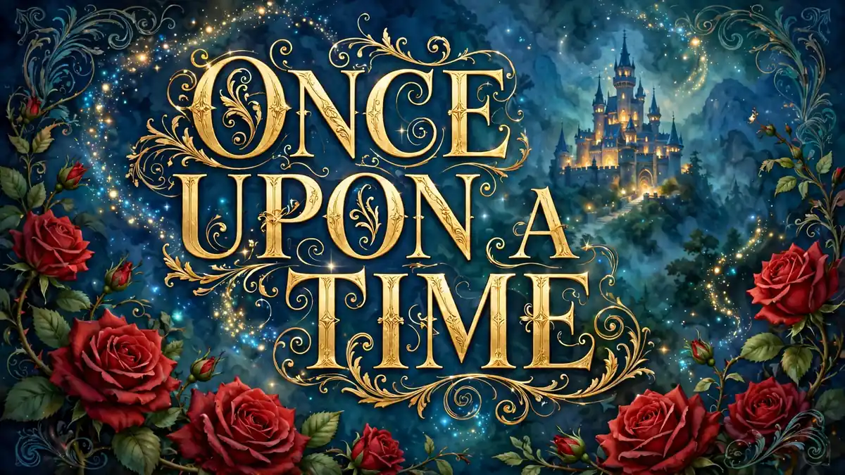
At heart, this is an ornate serif font built for display work. The capitals, in particular, carry small decorative flourishes and pointed, elegant edges. Moreover, the letter B usually shows the style most clearly of all. Its loops feel grand, theatrical, and unmistakably romantic at large sizes.
The lowercase letters behave more quietly by comparison. They are, nevertheless, tall, fairly narrow, and easy to read in short lines. Additionally, the strokes mix thicker downstrokes with much thinner connecting lines. Consequently, the whole alphabet feels handwritten and printed at the same time.
Which Characters Come With the Download?
Most fan versions include the basic Latin alphabet and simple numbers. The best-known recreation, for instance, offers only around fifty-three glyphs in total. Therefore, expect uppercase letters, lowercase letters, basic punctuation, and little else beyond that. Accented letters, in contrast, are often missing from these small files.
That limited set shapes how you should plan any project. Short names and headlines, for example, work beautifully in this storybook font. Long paragraphs, however, quickly become tiring and surprisingly hard to read. Above all, treat it as a headline face, never as body text.
Legibility also drops fast at small sizes, unfortunately. The fine strokes, moreover, can disappear on home printers and cutting machines. Hence, most designers keep this lettering above twenty-four points for print work. Similarly, they test one printed proof before producing a full set.
Typography choices like this reward a little curiosity, by the way. Our look at a Japanese writing set as a creativity and cost case study shows a similar lesson. In both cases, indeed, the character set decides what the design can do.
Where Do People Get It, and What About Generators?
Most people find this font through well-known font libraries and designer pages. FontSwan, DaFont-style libraries, and FontSpace-type sites, for example, list fan recreations clearly. Additionally, those libraries usually show the designer name and licence beside the preview. Therefore, they remain a safer starting point than random file-sharing pages.
Never trust a download button that hides the actual file name. A trustworthy page, in fact, names the font, the author, and the file format. Moreover, it states whether the licence covers personal or commercial use. If a page hides those details, consequently, you should simply walk away.
How Does a Beauty and the Beast Font Generator Help?
A beauty and the beast font generator works differently from a download. Basically, you type a name, choose a style, and download a preview image. The generator, therefore, suits quick mock-ups, party ideas, and social posts. However, it never gives you an editable font file for later projects.
Generators also help when your device cannot install fonts at all. School Chromebooks and shared tablets, for instance, often block new font files completely. In that case, moreover, a transparent preview image may be your only option. Nevertheless, you should still check the generator terms before sharing the image.
For real design work, an installed file is far more flexible. You can, for example, change colours, spacing, sizes, and wording in seconds. Additionally, you can reuse the same file across Word, Photoshop, and Canva uploads. Hence, most committed crafters eventually move from generators to installed fonts.
How to Install a Font on Windows, Mac, and Phone?
Learning how to install a font takes about two minutes, honestly. Firstly, download the file from a reputable library and save it safely. Secondly, open the ZIP folder and extract the font file inside it. The extracted file, moreover, usually ends in .ttf or .otf.
How Do You Install It on Windows?
On Windows, the process is reassuringly simple for beginners. Firstly, right-click the extracted .ttf or .otf file on your computer. Secondly, choose Install from the menu, and then wait a few seconds. Alternatively, you can drag the file into the Windows Fonts folder.
Afterwards, restart any program that was already open during installation. Word and Photoshop, for instance, rarely refresh their font lists automatically. Consequently, a quick restart saves a lot of confused searching later on. Finally, search the font list by name to confirm everything worked.
How Do You Install It on a Mac?
Mac users follow a very similar route through Font Book. Firstly, double-click the font file, and a preview window will open. Secondly, click Install Font at the bottom of that preview window. Moreover, Font Book will warn you if the file looks damaged.
Take those warnings seriously, even when they feel slightly annoying. A corrupt file, for example, can cause odd spacing and missing letters. Therefore, download a fresh copy from the original library if problems appear. In addition, keep the original ZIP file as a simple backup.
Can You Install It on a Phone or Tablet?
Phones are possible, although they need one extra app. On iPhone and iPad, for instance, apps like iFont guide the installation steps. Additionally, those apps install the font as a configuration profile instead. Therefore, you must approve that profile inside your device settings yourself.
How Do You Use It in Canva and Cricut?
Installed fonts shine brightest inside proper design tools, frankly. Canva and Cricut, in particular, cover most invitations and craft projects completely. Moreover, each tool handles this fairytale lettering in a slightly different way. Consequently, the workflow below saves trial and error on both platforms.
How Do You Use a Canva Fairytale Font?
A canva fairytale font project usually starts with uploading your own file. Canva Pro users, for example, can upload fonts through the Brand Kit area. Firstly, open Brand Kit and choose the upload a font option there. Secondly, select your file, confirm your usage rights, and then start designing.
Free Canva accounts cannot upload custom fonts, unfortunately. Those users, instead, can pick a built-in fairytale style from Canva itself. Cinzel Decorative, Great Vibes, and Parisienne, for instance, all suggest storybook romance. Additionally, a downloaded preview image from a generator works as a workaround.
Inside Canva, use the ornate lettering only for names and headings. Body details, moreover, deserve a clean serif or sans-serif underneath it. As a result, guests can read dates, venues, and RSVP details easily. Above all, export print work as PDF Print for sharper results.
Why Do Crafters Love It Among Cricut Fonts?
As one of many decorative cricut fonts, this style cuts beautifully at larger sizes. Names on banners, for example, look stunning in gold vinyl or glitter card. Moreover, the bold capitals hold their shape well during weeding and transfer. Consequently, party sets look polished without complicated layering or extra effects.
Size still matters a great deal with cutting machines, though. Tiny letters, in contrast, tear easily because their strokes are so thin. Therefore, test-cut one capital letter before committing expensive vinyl or cardstock. Additionally, choose the bolder recreation if your chosen file offers one.
Crafters often pair a cut title with a handmade base, too. That hands-on spirit matches our guide to the best wood for painted furniture and creative projects nicely. Indeed, a storybook sign looks wonderful on a smooth, painted wooden board. Similarly, a plain board lets the golden lettering carry the piece.
What Are the Best Uses for This Enchanted Font?
The obvious home for this lettering is a font for invitations, of course. Birthday parties with a fairytale theme, for example, suit it almost perfectly. Moreover, baby showers, book clubs, and school plays all borrow its magic. In each case, furthermore, one short headline does all the work.
As a wedding invitation font, it needs a slightly lighter touch. Use it, for instance, for the couple names and almost nothing else. The venue, date, and menu, however, should sit in a calmer typeface. Consequently, the invitation feels romantic rather than crowded or costume-like.
How Does It Work for Parties, Classrooms, and Crafts?
Party decor gives the font even more room to play. Banners, table cards, favour tags, and photo props, for example, all work well. Additionally, cake toppers cut from card show the capitals at their best. Hence, a whole party set can share one consistent storybook look.
Personal crafts fill the rest of the list, happily. Scrapbook titles, journal covers, and gift tags, for example, all suit short phrases. Moreover, custom shirt lettering works when the words stay big and bold. Our piece on special education shirts that celebrate unique learning shows that personalised lettering carries real meaning. Indeed, a name in storybook letters can make a simple gift unforgettable.
The romantic mood also travels well beyond paper, by the way. Fans of dreamy styling will enjoy exploring Otome fashion for romantic dreamers for matching outfit ideas. Together, moreover, the outfit and the lettering create one complete fairytale look. As a result, themed photos and party pictures feel thoughtfully planned.
Which Font Pairing Ideas Work Best With It?
Good font pairing ideas start with one simple rule, always. The decorative font, firstly, gets the headline and the smallest word count. A calm partner font, secondly, handles everything the reader must actually absorb. Therefore, contrast is not a flaw here, but the whole point.
Cinzel pairs beautifully for formal, castle-like occasions and printed suites. Its carved Roman capitals, for example, echo old book covers and stone inscriptions. Moreover, Cinzel stays readable in dates, venues, and short formal lines. Consequently, many designers treat Cinzel as the default storybook partner.
Cormorant Garamond offers a softer and more literary alternative, instead. Its delicate serifs, for instance, suit poetry, menus, and thank-you cards perfectly. Additionally, it keeps long guest information elegant without fighting the headline. Hence, book-themed weddings and library parties often favour this pairing.
Josefin Sans brings a cleaner, more modern balance to the set. Use it, for example, for addresses, websites, and practical event details underneath. Moreover, its geometric lines stop the design from feeling too old-fashioned. As a result, younger audiences often prefer this lighter, fresher combination.
How Do Colour and Paper Change the Pairing?
Vintage projects can borrow mood from other eras, too. The timeless tailoring in our guide to 1950s men’s fashion suits and iconic elegance shows how restraint creates glamour. Likewise, storybook typography looks richest when gold, cream, and deep blue dominate. In contrast, rainbow colours quickly cheapen the fairytale effect on paper.
What Are the Best Similar Free Alternatives?
Sometimes you need the mood without the exact fan file. Fortunately, several legal alternatives capture a very similar fairytale feeling today. Moreover, many of them include fuller character sets and clearer licences. Consequently, they often serve commercial and classroom projects far better overall.
Cinzel Decorative is the closest widely available cousin, arguably. It is, for instance, free on Google Fonts with an open licence. Additionally, its engraved capitals suit titles, covers, and formal invitations beautifully. Therefore, it is the safest first alternative for most designers.
Great Vibes and Parisienne cover the romantic script side instead. Both, for example, appear in Canva and Google Fonts for easy access. Moreover, they read more smoothly than the beast lettering at medium sizes. Hence, they suit names and quotes where flowing calligraphy matters most.
Anyone hunting a calligraphy font free for personal projects has further options. Allura, Alex Brush, and Tangerine, for instance, all live on Google Fonts. Additionally, each one brings proper accents, numbers, and punctuation with it. As a result, non-English names and phrases usually work without surprises.
Which Alternatives Suit Scripts and Manuscript Styles?
An elegant script font like Pinyon Script adds a formal, handwritten flourish. It suits, for example, certificates, menus, and classic wedding suites very well. Moreover, its licence is open, so small commercial jobs become simpler. Nevertheless, its fine lines still demand large sizes and good printers.
Other storybook options deserve a quick mention here, too. UnifrakturMaguntia, for instance, gives a bold, old-manuscript blackletter flavour instead. Pirata One, similarly, leans into adventure tales and treasure-map energy. In contrast, Almendra Display offers gentler, literary capitals for book covers.
Fonts also reflect the culture that produced them, always. Our article on fashion as a reflection of social movements makes that point through clothing. Typography, likewise, carries history, romance, and nostalgia inside its letterforms. Therefore, choosing an alternative is really choosing which story to tell.
Seasonal projects can push the fairytale mood even further, incidentally. The spectacle described in the magical Fashion Island tree lighting experience shows how lighting transforms a scene. Similarly, gold lettering on a deep background creates instant evening magic. Consequently, holiday cards and winter parties suit this palette especially well.
What Should You Know About Licensing and Safe Use?
This section matters more than any download button, honestly. Disney-inspired fan fonts, moreover, are usually free for personal use only. That rule, in fact, appears again and again across font libraries. Therefore, assume personal use only until you read the actual licence.
Personal use covers your own party, classroom, and hobby projects. It includes, for example, invitations for your family and signs for home. Selling products with the lettering, however, counts as commercial use instead. Consequently, Etsy products, client logos, and paid invitations need different permission.
The film studio also owns its film titles and artwork, separately. A font licence, therefore, never grants rights to the movie brand itself. Moreover, using character images or official logos raises a second, bigger issue. Hence, keep fan lettering for private fun and away from products.
How Can You Download and Use It Safely?
Safe practice is simple once you know the steps, fortunately. Firstly, download only from established font libraries or the designer directly. Secondly, open the licence file or licence section before installing anything. Thirdly, keep that licence note saved alongside your project files permanently.
When commercial use matters, switch to an open-licence alternative instead. Cinzel Decorative and Great Vibes, for example, carry licences allowing commercial work. Moreover, their terms are published clearly by Google Fonts for everyone. As a result, client work becomes calmer, cleaner, and fully defensible.
Frequently Asked Questions
Is the beauty and beast font free to use?
Yes, the best-known fan version is free for personal projects. However, its licence normally excludes commercial use, products, and client work. Therefore, read the licence on the library page before every important project. Moreover, keep a screenshot or copy of that licence for reference.
What is the closest font to the film lettering?
The fan file BeautyoftheBeast copies the film mood most closely, generally. Cinzel Decorative, however, is the closest safe and widely licensed alternative available. Additionally, it includes better accents and punctuation than most fan files. Consequently, many professionals start with Cinzel and adjust spacing by hand.
Can I use this font in Canva without Pro?
Custom uploads need Canva Pro, so free accounts need another route. Free users can, for example, insert a generator preview as an image. Alternatively, they can choose Cinzel Decorative or Great Vibes inside Canva. Moreover, both built-in options keep text editable for later changes.
Why do some letters look missing or wrong?
Small fan files often lack accents, symbols, and some punctuation marks. The missing character, therefore, appears as a blank, box, or fallback letter. Additionally, corrupted downloads can break otherwise complete and healthy font files. Hence, reinstalling a fresh copy from the original library usually helps.
Can I sell items made with this font?
Usually no, because the common licence allows personal use only. Selling shirts, mugs, or invitations, moreover, counts clearly as commercial use. Therefore, switch to an open-licence alternative for anything you plan to sell. In addition, check the marketplace rules for fan-inspired designs before listing.
What size should I print or cut this font?
Keep printed headlines above twenty-four points for a clean result. Cricut projects, similarly, work best when names measure several inches wide overall. Moreover, a test print or test cut reveals thin-stroke problems early. As a result, you save paper, vinyl, and a little patience.
Final Thoughts on Storybook Typography
Done well, storybook typography turns ordinary words into a small event. The beauty and beast font, moreover, brings romance, theatre, and nostalgia together instantly. Additionally, it works across invitations, classroom displays, party decor, and personal crafts. Therefore, its popularity after so many years makes complete sense.
Success, however, depends on restraint more than on decoration itself. Use the ornate letters briefly, firstly, and pair them calmly, secondly. Thirdly, respect the licence, especially when any money or client is involved. Finally, test sizes in print or vinyl before producing the full set.
Keep those habits, and your fairytale headline will look genuinely magical. Your guests, moreover, will read every detail without struggling at all. Indeed, that balance of wonder and clarity is the real fairytale ending. After all, beautiful lettering should serve the story, never hide it.